Generated Media
Images and videos generated via Higgsfield, including failed and pending attempts.
Create a centered hero composition showcasing a minimalist logo design featuring a white circle inside a navy square (#132A4F), with text "Smart C.C." placed directly below. Apply brand colors with flat, vector-based execution, ensuring bold, sans-serif typography. Maintain a clean and professional appearance with tight spacing between the circle and square, allowing more white space around the logo. Ensure the primary navy is prominent, exclude any uploaded logos, and maintain strong contrast with white backgrounds. Avoid off-brand colors, non-minimalist elements, and visual clutter. === REFERENCE IMAGE COMPOSITION TO PRESERVE === Objects to preserve: * Circle; Square; Text (3 total) Object placement: * Circle inside a square centered in the frame, text below the square. Scale relationships: * Circle occupies most of the square, text is small below the square. Orientation / angle: * Objects are oriented straight and horizontally aligned with text. Foreground / background layering: * Overlap/layering: Circle sits within the square, text is separate below. * Foreground: Black square with white circle and text. * Background: White background. Negative space: * White space around the square and circle. Visual hierarchy: * Focal point: Circle inside the square. * Visual hierarchy: Circle and square are noticed first, then the text. Composition type: * Centered hero. Spacing / alignment: * Tight spacing between the circle and the square, more space below the text.; Centered alignment. Additional reference guidance: * Create a central logo design with a prominent shape inside a larger shape, using high contrast with a clean, minimalist font positioned below. Ensure all elements are centered and maintain a strong visual hierarchy, starting with the main shape. === BRAND IDENTITY TO APPLY === Colors: Black; White Typography: Bold, sans-serif font with varying sizes. Logo placement: Do not use logos unless uploaded Visual mood: Modern; Professional; Minimalist Color application: Use brand primary and accent colors prominently. Typography application: Adopt modern sans-serif fonts in bold weights. Avoid: Use off-brand colors; Implement non-minimalist elements Use these reference composition details and brand identity values as mandatory constraints. Object presence, placement, scale, orientation, layering, and visual hierarchy must match the reference image. Apply the exact brand colors, typography, and mood specified above. (If an image is uploaded, consider that image idea in aspect and objects, and their placement)
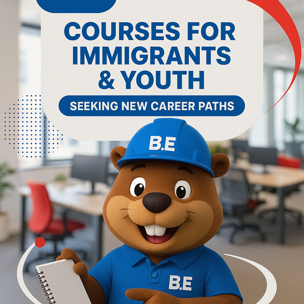
Create an engaging Instagram Reel featuring B.E., the mascot, in a vibrant office environment showcasing B.E. Academy's diverse range of courses. Highlight interactions with educational materials, focusing on offerings for immigrants and youth seeking new career paths. Use bold sans-serif typography, maintaining clear structure and white space. Employ primary blue with red accents and white highlights throughout. Integrate circular and swoosh graphics to emphasize movement and engineering themes. Position 'B.E.' logo using the real brand logo at the top or bottom for visibility. Maintain a balanced layout with readability, avoiding clutter, unreadable text, and off-brand colors. Aspect ratio: 9:16, ideally suited for Instagram.
Open full mediaBoost Literacy Skills: Create an Instagram carousel slide showcasing the benefits of Reach's tailored sessions to maintain progress. Use a clean, balanced layout with generous spacing. Incorporate vibrant summer tones, utilizing primary color palette of #23538f, #cea81f, and #f7f1e5 with summer-inspired icons. Typeface Poppins Bold for "Boost Literacy Skills," and Regular for "Tailored sessions to maintain progress." Blend real-life educational scenarios with engaging graphics that align with the educational and welcoming visual direction. Maintain a minimalist and easily recognizable style, ensuring brand elements are prominent. Use the real brand logo in the bottom-right corner, ensuring it's clear and undistorted. Avoid clutter and off-brand colors. Aspect ratio is 1:1, suitable for Instagram.
Create an Instagram carousel slide featuring a minimal alarm device casting a heroic cape shadow, aligned with the theme "Debunking Alarm Myths: Get the Facts!" as the main headline. Incorporate a bold "Security Insights" label. Use an asymmetrical layout with strong shadows and circular motifs to communicate security and engineering. Emphasize brand colors: blue (#0000FF) as primary, red (#FF0000) for accents, white for text, and apply neutral tones as image filters. Headline should be bold sans-serif, top-centered, with the real brand logo placed at the bottom. Maintain clear contrast between myth and reality, featuring engaging icons. Avoid clutter, unreadable text, distorted logos, off-brand colors, unnecessary extra text, and ensure every element aligns with the brand identity. Use real brand logo appropriately. === REFERENCE IMAGE COMPOSITION FIDELITY (MANDATORY) === This prompt is based on an uploaded reference image. The final image prompt MUST preserve the reference image's spatial composition with high fidelity. Specifically: 1. OBJECTS: Keep the same objects/elements that appear in the reference. Do not add, remove, or substitute major objects unless the brand/post context explicitly requires it. 2. PLACEMENT: Preserve where each object sits in the frame (top-left, center, bottom-right, etc.). If an object is in the upper-third of the reference, it must be in the upper-third of the output. 3. SCALE: Maintain the relative size relationships between objects. A small element in the reference should remain small; a dominant element should remain dominant. 4. ORIENTATION & ANGLE: Keep the rotation, tilt, and viewing angle of objects as they appear in the reference. 5. FOREGROUND / BACKGROUND: Preserve the layering structure — what is in front, what is behind, any overlap or stacking order. 6. COMPOSITION TYPE: If the reference uses centered composition, rule-of-thirds, diagonal, or symmetrical layout, the prompt must request the same composition type. 7. NEGATIVE SPACE: Preserve empty/breathing space in the same regions of the frame as the reference. 8. VISUAL HIERARCHY: The focal point and visual weight distribution must match the reference. Brand colours, typography, and stylistic treatment may adapt to the brand identity. But the SPATIAL LAYOUT, OBJECT PLACEMENT, and SCENE STRUCTURE must stay faithful to the reference image. Do not invent a new composition. Do not rearrange objects. Do not drift into a generic layout. (If an image is uploaded, consider that image idea in aspect and objects, and their placement)
A simple minimal 9:16 product photo of a white coffee cup on a wooden table, clean natural light.